Tuesday, December 11, 2007


The men and women were piled onto a metal flatbed and stripped naked, some with nothing but clear numbered plastic bags over their heads, and some with no heads at all. Their limbs were contorted, their toes broken, and bits of their ears and eyelashes were missing. Stray upper torsos were strewn next to a sampling of dismembered legs, some discolored, others with holes in them, and a select few still curiously standing in an upright position.

Behind the flatbed were a sea of cardboard boxes and piles of oversized bubble wrap folded neatly on the floor. A sign on a nearby cabinet read: "Adel Rootstein: We're only human, the mannequins are the perfect ones."

Representative of a human ideal, mannequins are “the perfect ones” because in order to incite the desire to buy, they must project an image that consumers yearn to emulate. As beauty ideals, trends, and values are in constant flux, however, these fiberglass renderings of humans are forever re-synchronizing to the frequency of zeitgeist.

Mannequins didn’t always have nipples, for instance. There were no practical or commercial reasons for them to have any until the 1970’s when the women’s liberation movement popularized bra-less tops that required more realistic breasts to showcase in the windows. The same goes for the long, shapely legs that are now seen on mannequins; in the days of ankle skirts, mannequin legs were no more ornate than shower rods. It wasn’t until the arrival of the mini in the 1980’s that mannequin makers toned calves and thighs so that the skirt’s many virtues could be appropriately showcased...


This is the beginning of a 3,000 word feature that I'm currently working on. If it's worthy of posting when I finish, I'll link to the final text.

Monday, December 10, 2007

A Brief History of Mannequins


When mannequins first appeared in store windows just after the Industrial Revolution, (1860’s England), they were far from perfect. The glass pane had just been invented, and as street lights became more prevalent, shop owners were eager to advertise their wares to evening strollers. Made of wood and stuffed with sawdust, these mannequins often weighed upwards of 300 pounds due to the iron fillings in their feet that kept them standing upright.

It was considered an improvement when they were finally made out of wax -- until they began melting under the hot filament lights of the displays. Even in their primitive and imperfect stages, mannequins served their sales purpose; women were drawn to the objects displayed on them. As retailers caught on to the sway that mannequins had over women, they began making them look and act more like their target consumers.

During World War I, for instance, mannequins became sprightlier as women began to join the workforce. By the arrival of the 20’s, “They tended to look a little tired-eyed...” said Robert H Hoskins, an assistant professor at the Fashion Institute of Technology (FIT) in an issue of Smithsonian Magazine. “As if to say, ‘I know where the speakeasies are.’ ”

By the end of WW II, mannequins became noticeably voluptuous, almost as a treat for the boys who had just gotten back from the war.


Shortly after, mannequin maker Adel Rootstein decided that mannequins were not hip enough to reflect the latest trends coming out of 1950's London. She began scouting out real models to base mannequins on, infusing the dummies with life and an identity.


Sunday, December 9, 2007

Manneken Piss


The word "mannequin" comes from the Dutch "manneken," which means little man or little doll.

Perhaps the most famous "manneken" is Manneken Piss is a legendary Belgian landmark. No taller than a two year old, manneken piss is in his very own special alcove in downtown Brussels, where, winkie in the air as he pees away to the delight of tourists.

Like the mannequins in the Rootstein showroom, Manneken Piss has his very own clothing designers that make all of his costumes.

Here he is around Halloween:


Around Christmas:


And dressed as a Musketeer:


A fun Fact about manneken piss:
When Viagra made its debut in Belgium, they pumped up the force on the water behind Mannken's winkie, and had his pee shooting all the way across the street.

Manneken Piss also has a sister, Janneken Piss, that fewer people know about. Unlike the splendid plaza location that her brother has, Janneken is located at the end of a long, rather deserted street. There are bars up in front of her, and she is set far back, which makes her even more difficult to see.

Thursday, December 6, 2007

Garden of the Gods -- Latest Mannequin Collection at Rootstein

Photo slideshow from the Rootstein cocktail party on December 6th 2007:

Tuesday, December 4, 2007

Mannequin in a Suit; A Law Suit


Bloody scalps, cracked teeth, loss of feeling in the fingers, root canals, slipped discs, unconciousness...herpes. All this from mannequins??

Here's a brilliant article by Roy Rivenberg, staff writer at the L.A. times, about the uncanny accidents that can happen around mannequins:


"Attack of the Mannequins" might sound like a horror film title, but, for some shoppers, it could also be a documentary.


Diana Newton, 51, of Westminster sued the J.C. Penney Co. last month after she was allegedly thwacked on the head by a department store dummy.


Newton said she was ambushed by a legless female mannequin at the company's Westminster Mall store, a skirmish that left her with a bloodied scalp, a cracked tooth, recurring shoulder pain and numbness in her fingers.


The alleged attack was the latest in a string of mannequin mayhem incidents nationwide.


"There are a slew of lawsuits like this," said mannequin manufacturer Barry Rosenberg, who joked that stores should run background checks on dummies before letting them mingle with shoppers.


Most of the cases involved mannequins toppling over onto customers, but an Indiana woman claimed she caught herpes from the lips of a CPR training dummy. She dropped her lawsuit against the American Red Cross in 2000 after further tests revealed that she didn't have the disease, according to news reports.


The alleged Westminster Mall incident happened nearly a year ago in the women's department at J.C. Penney. Newton said she wanted to buy a certain blouse, but the only one in her size was being worn by a mannequin.


When a salesclerk tried to remove the garment, the dummy's arm flew off and struck Newton's head, according to her lawsuit, which was filed in Orange County Superior Court and seeks unspecified damages.


"I felt a burning sensation," she recalled. Then, blood cascaded down her face, she said.


Paramedics arrived and patched her gash. Feeling woozy but stable, Newton drove home, then had someone take her to Hoag Memorial Hospital Presbyterian in Newport Beach for further treatment.


"'My mom got beat up by a mannequin' was the joke around my house," Newton said.


Her attorney, A. Jay Norton, said the case might sound comical, but he insisted the mannequin inflicted lasting damage on his client.


Norton said Newton still suffers shoulder pain and "strange sensations in her hands." Read more about Newton's cracked molar and other mannequin inflicted injuries here...

Monday, December 3, 2007

Salvador Dali and the Defenestrating Bathtub


According to Mary Portas in her book, The Art of Retail Display, Salvador Dali was commissioned by the New York store Bonwit Teller to create two window pastiches exploring the myth of Narcissus.

Dali, the eternal optimist, responded with a mannequin propped in a bathtub full of muddy water, crying blood tears, and surrounded by hundreds of hanging hands holding mirrors (What would Ovid say?). The store deemed Dali's interpretation too extreme for its windows, and ordered him to take it down. According to Portas, Dali slipped while emptying the bathtub, which then sent the latter crashing through the store window and onto 5th Ave. Never losing out on the chance for a spectacle, Dali supposedly dove after it (out the window and onto 5th Ave).


(Perhaps the precursor to Dali's myth of Narcissus)

Simon Doonan, the legendary head window dresser at Barney's, recounts the story differently. According to his version, store employees were instructed to take the display down so as to spare the surrealist's feelings, but when he found out what had happened, Dali pushed the bathtub through the window in a fit of rage.

I was unable to confim which version was true, but either way, a muddy bathtub and a bloody mannequin were defenestrated onto 5th Ave! Bergdorf's hasn't done that.


(Dali's Backyard)

My inkling: I've been to Dali's house in Figueras, and judging by the rather strange objects that still remain in it, most notably his large collection of taxidermied animals, I am more convinced by the second version.

Sunday, December 2, 2007

A Quickie With Dianne Brill


Dianne Brill, legendary New York City party queen, high fashion model, intimate friend of Andy Warhol, and stylist for the Rolling Stones, Duran Duran and Prince, was sculpted as a Rootstein mannequin.

Hailed as “The Shape of the Decade,” Brill’s mannequin, complete with her characteristic bouffant hair, pneumatic chest and chandelier hips, has dazzled shop windows all over the world.

To be a Rootstein mannequin, Brill, like most subjects, spent three weeks in a London studio posing for the clay replica that was made of her body. Adel Rootstein, the company's foundress, and Kevin Arpino, her protégé, oversaw the process, while John Taylor, Rootstein’s top chisel, sculpted Brill's body.

“John is like a magician, funny and talented like the whole Rootstein gang,” said Brill. I felt like a muse for those weeks as he noticed and adored everything about my body.”

Though they are inanimate, Rootstein mannequins do not lack personality. The Dianne Brill mannequin, for example, is posed with her hands spread out to her sides and one foot in front of the other as if she’s making an entrance; something that Brill is famous for doing.

“Holding the Dianne Brill ‘making an entrance’ stance for those weeks half naked was challenging,” said Brill, “but the result was perfectly me.”

Over the years, Brill has enjoyed seeing her body pop up in various places.

"Once I walked past Selfridge's in London,” said Brill. About 18 of my mannequin were lined up all in a long row, all in their underwear. It was outrageous!”

Simon Doonan, the top window dresser at Barney’s New York famous for featuring personalities such as Bette Middler, Tina Brown, Dan Quayle, Cher, Magic Johnson, and Madonna in his windows, also did a Christmas display including Brill.

"I used to stand by the window and have my boyfriend take pictures of me with it; I was so happy to see that all the creative and pose work became such a beautiful reality,” said Brill.


Though Brill’s mannequin still flaunts the legendary and unusual 40-23-39 measurements that Brill herself no longer even has, this former muse of fashion designer Thierry Mugler’s and favored model for Jean Paul Gaultier and Vivienne Westwood still considers being a Rootstein mannequin as a present force in her life.

“Sometimes I see them in odd places like a German chocolatier’s window dressed in a pink satin dirndl and a white ruffle hat. I like to see the blonde ones best because they feel most like me,” said Brill, whose sky-high platinum locks make
Barbara Eden of “I Dream of Jeannie” look like she has a buzz cut by comparison.

“Every once in a while I’ll still get someone that will Fedex me my arm or something and ask me to sign it,” said Brill. “I sign it, of course, but I prefer to stay naive about what they're doing with it afterwards."

Brill is currently living in Switzerland promoting her makeup line, soon to be avialable in the U.S.
Check it out

Saturday, December 1, 2007

Movie Review: Lars and the Real Girl


The movie “Lars and the Real Girl” was just released. Basically, a delusional 30 something year old named Lars orders himself a mannequin (sex doll) named Bianca, but doesn’t use her sexually. His attraction for her is everything but physical – the closest he gets to touching her involves pushing her wheelchair or lifting her in and out of a bed (which he doesn’t even share with her). A doctor suggests to his concerned brother that he just play along with the fantasy, something that the entire town ends up doing. Church members embrace her, women at the salon are happy to do her hair and give makeovers – she ends up being so popular that Lars hardly gets to spend any time with her. 


In the end, Lars is cured. He is able to detach himself from Bianca, (he imagines that she falls very ill and dies), and moves onto the perky blonde girl that's been eyeing him at the office. While the screenplay and scenery of the movie are nothing extraordinary, I rather appreciated that the movie forced the audience to entertain the idea that a mannequin could be treated as a human. Bianca was a companion to Lars; her "company" helped him gather the courage to build real human relationships, and helped his community (who became rather smitten with her), better understand his eccentricities.

I have an inkling that this movie may be inspired by the true story of Lester Gaba, a mannequin maker in the 1930's that fell in love with his creation, "Cynthia." Cynthia was made of wood and posed in a sitting position, elbow on her knees and a cigarette in her hand. She accompanied Gaba everywhere; to social clubs, on carriage rides, and to his seat at the opera. Gaba required a team of 3 men to help transport her around (wooden mannequins are much heavier than the fiberglass ones used today), but despite these difficulties, Cynthia was beloved by many. Designers sent her dresses, Cartier and Tiffany's event lent her jewels. Unfortunately, Cynthia met her untimely death at a salon when she slipped out of a chair and shattered into a thousand pieces.


Whether Gaba's story was the inspiration for "Lars and the Real Girl" or not, it is somewhat intriguing that the possibility of mannequins coming to life has been a recurring theme in our culture.

Friday, November 30, 2007

Not Exactly Da Vinci -- The Moaning Lisa Mannequin


Forget the iphone, the latest in gadget interface is the Moaning Lisa, a female foreplay mannequin that uses sensors to respond to stimulation with an entire library of sounds that she can be programmed to make, including a library of over 200 different moans!


Developed by multimedia artists Matt Ganucheau, Kyle Machulis, and Kelly Moore, this vixen version of la joconde is no Tickle-Me Elmo. Routed with a controller board programmed with advanced multitouch software (conveniently located in her pneumatic chest), Lisa is sensitive to the speed, duration, and sequence of touch input, meaning that a certain degree of arousal must be attained before she'll respond. So basically, it's technologically impossible for her to fake it!

(Photo credit: Kyle Machulis)
For more information

Wednesday, November 28, 2007

Holiday Windows, Bergdorf Goodman


The black tarp that has been convering the windows at Bergdorf Goodman for the past week has finally been removed, revealing a scintillating display of luxuriant and otherworldy window designs.

The theme this year was "elements;" Air, Water, Light, and Earth. A tribute to Tony Duquette, the designer that died in 1999, the windows are reminiscent of the opulent, ornately gilded, and lavishly bedizened costumes and stage sets that he was famous for designing. (Think Liz Tayor meets Liberace).


"Water" for instance, is a chimerical combination of crustaceans and tiny bongo, tambourine, and accordion playing monkeys in red fez and matching coats. Though very captivating in their nautical theme, surrounded by thousands of white mother of pearl shells, the window's focal point is certainly the woman in the dazzling taffeta-bottomed gown that is sultrily being led in a tango by an alligator with jeweled eyes. The overall feel is that of an underwater mardi gras of sorts, though the dominance of red and and white as well as the endless display of seashells are vaguely reminiscent of Santiago de la Ribiera -- a celebrated Saint of a Spanish port city whose favored colors were red and white.

Ruben Pazos, one of the designers that worked on the windows, assured me that every seashell, every sequin, and every mirror in every window was hand stiched, glued, and or placed. The windows have been a work in progress for the past year (mainly their design), and production began last May. Even after the windows had been revealed and viewed by thousands of pedestrians, Ruben was still patrolling for perfection. Design plans in hand, he assiduously examined the "Water" window, making sure that each detail, down to the tiny conch shells surrounding the tiny pedestal where the tiny felt-hat salior stood holding an even tinier flag...were all in their place.


"Air" features a life-size golden elephant covered in jewels from trunk to toe flying through the air with an empress sitting effetely on his back. Though perhaps the least "busy" in the sense that there aren't too many things going on around it, this window seems to get the most attention.


True to its name, "Light" makes anything that Diana Ross wears look like baked potato. Thousands and thousands of circular mirrors reflect the glamour of the red-headed woman seated, legs crossed, before a sparkling 1930's microphone. Though it does have its fair share of critters and small quirks, including a large gold hanging grasshopper that dangles just above the mic, this window is the least imaginative.

Being an Aries, I was excited to see what Bergdorf would do with "Fire." Perhaps by the time I got to this window I had been so barraged with sparkle that it ceased to impress me, but I was not a fan of this window. The dominance of gold made it feel like what I imagine to be the lobby of a 7 story hotel in Dubai. The mannequin's wig, shaped like a Chinese character, is pretty impressive, but otherwise there is nothing worth standing in the cold for.

"Earth," by contrast, is much more refreshing with its palette of poland spring green and pristine white. There is also plenty to look at -- a towering white giraffe with beautiful green, chartreuse, and pink designs painted on it, an oversized snail, a pair of festive monkeys, grasshoppers, and even a poodle.


This window wasn't part of the elements, but I think the parasol-shaped wig is splendid:


I've made a short musical photo show to feature the windows, but unfortunately, quicktime and youtube have really messed with the quality and timing, so I won't include it here.

Tuesday, November 27, 2007

Counterfeit Mannequins


Rootstein mannequins can be found anywhere from the affordable and fashion-forward H&M and Zara, to the slightly pricier Anne Taylor and Ralph Lauren, to the decidedly high-end Chanel, Escada, Neiman Marcus, Saks, Barney’s, and Miss Selfridge’s. Many are also sold and resold on ebay (most often in entirety, but sometimes in bits – stray hands, a set of legs, an arm), because their quality and design render make them timeless display fixtures and desirable collectibles. Just type Rootstein into the ebay search bar and you'll be sure to find a few for sale. Pat Marino of the Rootstein factory in Brooklyn actually told me that many vendors say Rootstein in their sales description, even when the mannequins are made by a different company so that they can sell them at a higher price and attract more buyers.


The clothing chain, Forever 21 is notorious for ripping their clothing stylesfrom luxury designers, but did you know that even many of their mannequins are counterfeit? Peek into their Union Square store(right next to Whole Foods) and you'll see their Rootstein knockoffs.


No respect for original design!

Holiday Windows at Macy's, Lord and Taylor, and Saks 5th Avenue


Spaeth Designs Inc is the company that designs and builds the sets for holiday windows at each of these landmark establishements. The snowpeople at Saks, the Miracle on 34th Street of Macy's, and the Tastes and Aromas of Christmas at Lord and Taylor -- all of these are the creative work of Spaeth's 50+ person team.

Located on 57th street and 10th Ave, it's Christmastime all year long at Spaeth's showroom/workshop. As early as March before the next Christmas, visionary window architects are already teaming up with the creative directors of each department store and trying to decide on a theme for the season.

An insider at Spaeth confesses that the window specialists and creative directors spend a lot of time discussing, sometimes fighting over what will be featured in the displays. Because Spaeth carries three major department stores that despite being all owned by the still company (Federated), are still in competition, the employees must also be careful to ensure that the ideas of each aren't too similar.


"We spend a lot of time covering and draping things," said the Spaeth insider, "When the creative team from Macy's comes in we have to scramble and cover up our designs for Lord and Taylor," etc.

The windows are designed as if they were homes or buildings -- a small architectural model is made of each, and once the creative team from the store approves, the actual sets can be built. All sets, dolls, toys, and accessories are made by Spaeth, which contains a HUGE animation and props department to be able to satisfy the demand. Everything from ribbons, bows and tassels to mini pianos, puppies, and tea cups figure into their repertoire.

Do the Spaeth window designers get sick of the holidays by the time they roll around? "No!" Says the Spaeth insider....just like everyone else, he strolls the avenues to admire the windows and loves to show off the many intricacies of his work to his friends and family.

Sunday, November 25, 2007

Steel Drums at Saks

The holiday windows at Saks set to a bit of a different tune -- music by Curtis G, a steel drum musician that plays in front of Saks 5th Ave.

Wednesday, November 14, 2007

Barbie Comes to Patricia Fields


In honor of the Barbie-inspired clothing line that Pat Fields has just debuted for Mattel, the store's windows have become a bubblegum pink bonanza.

The Barbie line is available exclusively at Macy's and Hot Topic.

See my October entry on Patricia Fields for a context to these windows.

Sunday, November 4, 2007

Mannequins are controversial objects!

Some people fall in love with them.

Some people are scared of them.

And there are some people they should be scared of!

Monday, October 29, 2007

King Tut and the World's First Mannequin


The most primitive form of mannequins can be traced back 3000 years to the time of Tutankhamun. More commonly known as "King Tut," this famed Pharoh met an untimely death at the age of 19 and was buried with a wooden torso which archeaologists believe to be the world's first dress form.


King Tut is now on public display in Egypt for the first time since his tomb was discovered 85 years ago by archaeologist Howard Carter. He will then travel to London, eventually passing through the Dallas Museum of Art. Though it is unlikley that the many torsos and talisman he was buried with will accompany him on this journey, but his 3000 year old leathered, weathered, body is proof that those Egyptians thought of everything!

Monday, October 22, 2007

The Sartorialist - Mannequins vs. Live subjects


Though mannequins can be placed in a variety of extravagant scenes that make them eye-catching and bring out the clothes that they wear, there is something about seeing a skirt twirl around a set of dancing legs, or a bejeweled bracelet catch the light as it travels on a gesturing wrist, that will never be recreated on a still object.

The Sartorialist has a fine eye for photographing people whose outfits are shop window worthy, yet worn by real people. All of his work is displayed on his blog, which I've become quite addicted to. He travels constantly so you get snapshots of how people are dressing all over Europe, and each photo is laced with nuance and character.

I encourage you to check it out!

Thursday, October 18, 2007

Oprah is My Wardrobe Mistress


In a section of his writings called "Man the Interior Designer," Jean Baudrillard suggests that serial objects, or what he refers to as "furniture," are simply pre-designed objects that suit the pre-existing values of an industry that is emblematic of all commodities. He calls man a "a mental hypochondriac... someone obsessed with the perfect circulation of messages," and though many will dismiss him as crazy, ultra-marxist, or perhaps simply, "French," I think he might be onto something.

Today I spoke with Carmen Garcia, a visual merchandiser at Ann Taylor. She explained that all the visual mercandising done in the store is decided by a team at the Ann Taylor headquaters. This team sends her a book with sketches detailing which shirts should go on which mannequins, and where each should be arranged within different areas of the store.

Their strategies are based on the assumption that they know what their customers are looking for. For example, during the month of October, people are looking for fall and heavier winter wear, so coats and sweaters make it to the front of the store. Business wear, however, is also still in priority since people are coming back from summer vacation and looking to refresh their work wardrobes for the year.

Garcia assured me that a product featured in the store windows almost always demonstrates a visible rise in sales once it is put on display there. However, boosting its sales is also the fact that window products are often also simultaneously shown in a magazine, or on Oprah, for example.

So if I've understood this correctly, someone at O Magazine decides that a skirt in Ann Taylor is attention worthy. It gets some sort of publicity, either in O Magazine or in another one where Ann Taylor frequently places ads. The visual merchandising team at the Ann Taylor headquarters gives the orders to have it featured in a window, and the store based team executes the design. You (or me, though I'm not at all into Ann Taylor), naive shopper, see it and think "gee, I like that," without realizing that you probably only like it because you've seen it favorably portrayed in so many other places: on Oprah, in a magazine, perhaps on someone else who has already purchased it, and now in the store.

As you buy the skirt, you also buy the mental hypochrondria of our society, proving to visual merchandisers that their messages are getting through to you. Slightly Orwellian, yeah?

Tuesday, October 16, 2007

Patricia Fields


This month’s Patricia Fields window features a mannequin wearing emerald green tights, a yellow and black can-can taffeta tutu, and an aqua, magenta, and royal purple sequined horizontally striped tube top. A large cotton-candy colored pink boa bedizened with nickel-sized silver reflective circles is draped over her neck, as electric pink and canary yellow feathered armbands, teal earrings, and a rubber toucan nose, all contribute to her chimerical appearance.

She is crowned with a whopping tangerine, pink, indigo, yellow and cerulean wig designed by Tobel, the in-house wig designer that works out of the hair salon in the basement of Patricia Fields. A marvel in synthetic hair design, this latest creation can only be described as an inspired fusion of Marie Antoinette, Marge Simpson Tina Turner, and a cockatoo.

“I work a lot with birds because I think they’re beautiful,” said Artie Hach, the store's head visual merchandiser, pointing to a dead bird that he used as part of wig for the scarecrow-woman figure also in the same window as the toucan one.


“I added the scarecrow to make the window a little scary -- I was inspired by the movie ‘Jeepers Creepers;’ I’m sexually attracted to the demon,” he added.

Hach went to FIT for exhibition design, but he is an equally talented stylist. He worked with Patricia Fields on seasons 1-4 of “Sex and the City,” earning an Emmy and many skills that have enriched his abilities to outfit the mannequins he uses in his visual merchandising.

“The four years I worked on ‘Sex and the City’ were like a second college and the Emmy was like my degree,” said Hach, who has since also taken on many freelance large-scale window design products for H&M and Macy’s.

Often seen with a ladder, screwdriver, or spare light bulb in his hand, Hach’s job is to maintain the store looking spry and to ensure that products, especially the best-selling ones, are effectively featured.


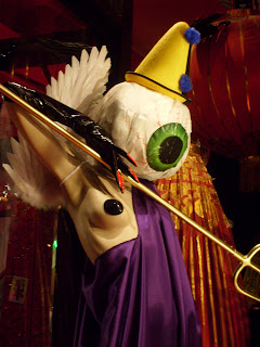
The second window features a sexy geisha girl being kidnapped by the armageddon creature (a one-eyed scepter wielding monster in a Willy Wonka purple jumpsuit and a pastie over his right nipple) and a biker babe with a Flinstone-sized bone in her hair and a black studded patch over her left eye.

Monday, October 15, 2007

A notable read: Simon Doonan, Confessions of a Window Dresser.


Simon Doonan, the head window dresser at Barney's New York since 1986, was born in Reading, England, a town whose sole distinguishing characteristic was the large biscuit factory that employed the majority of its population, paying English factory workers better wages than the Irish factory workers who did the same job. He made his first rumbles as a window dresser in the London store Nutters, where he featured live rats rummaging through trash cans wearing rhinestone collars. Eventually, he was invited by Tommy Perse to work at the Los Angeles based store, Maxfield, where he designed a host of controversial windows, including babies being kidnapped by coyotes.

Doonan's book is a sharp, comedic biography/history of the visual merchandising industry, including several photographs of his work throughout the past 20 years. Most notable are his windows featuring Tina Brown, (former editor of The New Yorker), Dan Quayle, Queen Elizabeth, Bette Midler, Prince, and Madonna, who he "did 3 times."

Sunday, October 14, 2007

Mind the GAP


Though not visible to customers, just about every corner of the GAP has a title; the après ski lounge, the martini bar...these are just a couple of the names that the GAP visual merchandising headquarters gives to designate the “effects” they want their display teams to achieve in each store. One or twice a season, the merchandising headquarters sends out a lookbook to each store with pictures of how the displays should be arranged. Based in the store layout, merchandisers are allowed to improvise, but the team from headquarters is always patrolling to make sure that the displays correspond with the GAP’s image and maximize advertising.

“We used to just put one thing on a mannequin,” said Eddie Calcano, head of visual merchandising at the GAP Rockefeller Center for the past 9 years. “But now we’ve started to layer things to give a more ‘boutique’ feel. You’ll see scarves, bags, belts, shoes and other accessories arranged together so that we’re showing a complete picture. We’ve found that customers like that.”

Two years ago, the women’s floor at the GAP was on the first floor, but it was discovered that few men ever shopped in the store. They would leave without bothering to go upstairs, believing that the store was exclusively for women.


“As soon as we moved men to the first floor, more men would come in. We didn’t lose the female customers either; you don’t have to worry about women finding their department. If there’s something for them, they’ll find it.”

Friday, October 12, 2007

Dirty Secrets of Visual Merchandising


As an avid window shopper and someone just generally fascinated by consumer tendencies, I can't help but ask myself, how do the salaries of these people figure in to what we're paying for our clothes? Those $130 black cigarette pants at BCBG -- how much of that $130 am I paying for the design and manufacturing of the actual product, and how much of it am I paying for the presentation of the product in the store itself? If the visual merchandisers at headquarters AND those more regularly present in the store need to get paid, on top of the overhead costs of renting, powering, stocking, and providing sales employees for the store, costs accumulate.


The key to visual merchandising, as I've been told, is knowing your consumer. Anticipating his needs, catering to his desires, and creating more of them. Take a look at the BCBG Maxaria store in Soho, for example. Sleek, hip, trendy -- caters to the young single girl who carries big leather totes, wears high heels with pointed toes, and likes to have ruby colored drinks in the meatpacking district on Thursday nights. The store's windows are filled with form-fitting, cleavage boosting dresses, curve enhancing sweaters, and other variations of predominantly "going-out" wear.

Now check out the BCBG Maxaria on Broadway and 68th. Wide aisles allow for the easy passage of strollers, and more conservatively displayed hip but serious business wear are the marquee here. This is the Upper West side customer that wants to be stylish at her business meetings, but still comfortable enough to pick up her kids after work.

None of this is an accident --

Thursday, October 11, 2007

Mannequins, The Silent Salespeople


"Mannequins are those silent sales people that show off the latest and greatest without bugging the customers, and with a little brains, they can be the most effective sales staff."
http://gouachesa.wordpress.com/

Is this true?

How influenced are you by what you see on mannequins?

Wednesday, October 10, 2007

Video!

Press play for a behind the scenes look at the Adel Rootstein mannequin showroom:
(Quite a rough copy of what I hope will be a much better final short clip once new material is integrated).
Update: I've been told that this video is very hard to hear. It plays decently on my computer, but then again, I'm very familiar with the text. Way TOO familiar!
I have about 4 hours more of additional footage, so as soon as it's all edited, I promise a much cleaner clip.

Tuesday, October 9, 2007

Adel Rootstein Mannequins


At the entrance to the Shawfield Hotel stands a 6'4 woman in stilettos and designer sunglasses. She is leaning against a cart full of shopping bags - Hermes, Dior, Chanel, and looking effete. To her right, just past the check-in desk stands a woman in a delightful double cashmere lemon sorbet colored skirt and matching jacket, and just behind her, another woman stretched across a chaise lounge extends her leg, admiring a pair of gray heels.


Walking further into the hotel, a surrepetitious waiter eavesdrops on a nearby conversation, as a Lenny Kravitz look alike checks out the rack on the cross between Cher and Lilly Munster with monster cleaveage. To the left, a serious set of very tall and very attractive set of fashion glitterati await an elevator, as a sultry couple heat it up on the floor in front of an adjacent fireplace.

Though this could easily be the lobby of a hotel in Aspen or Monte Carlo, it is the showroom of Adel Rootstein, premier mannequin maker, located on 19th street in Chelsea.

Monday, October 1, 2007

It's not what's on the outside - ALU, visual merchandising materials provider


ALU is an Italian company that specializes in the design and manufacture of merchandising materials (racks, displays, fixtures, lighting arrangements), and other "systems" used to sell merchandise in a store. Before visiting the showroom, I mistakenly believed that ALU manufactured display mannequins, but upon arriving and being very warmly received by Robert Mabry, the President of ALU, I was not at all disappointed by the absence of painted heads.

The showroom at ALU is located on the 6th floor of an unassuming building in Chelsea. Exiting the rickety, slow, dumb-waiter like elevator, I immediately entered a futuristic, spacious, and extremely entrancing area. (The euphoria of the experience was something akin to Charlie and Grandpa Joe discovering the room in Willy's factory with the Fizzy Lifting drinks).

Twice a year, a creative team, headed by Luca from Italy, tears down the entire showroom and replaces it with an entirely new installation. The most recent theme is "Leave your Mark" a maze of red, white and black modish installations with a bit of a fun-house theme, balanced by a tasteful and streamline design.

Mabry introduced me to the "fixture industry" -- the world of racks, boxes, display cases, shelves, and drawers, that merchandisers hang, drape, set, and prop their products on--" We use our merchandise to showcase theirs," said Mabry. ALU prides itself on producing quality, aesthetically pleasing, and practical products that can be modulated to change the look or purpose of the fixture.

Mabry introduced me to the world of visual merchandising trade shows:
Euroshop, held annually in Dusseldorf, Germany, one of the largest.
Globalshop, held every March in Chicago -also gets a big part of the industry to spin out their latest wares.
NADI, the National Association of Display Industries http://www.nadi-global.com/# is also a tremendous source of information and networking in the industry, especially via the conferences, conventions, and events that it holds throughout the year.

NADI's mission is to report the evolution of the visual merchandising industry, which seems to require a rather savvy pulse taker. Just 6 years ago, the visual merchandising industry found 80% of its clients in major department stores. This figure has now dropped to 35%. Mabry explained that this shift in figures is due to consolidation within stores -- they've begun to use in-house people to take care of all of their merchandising needs, and thus rely less on the expertise and products of outside companies. Interestingly enough, despite these changes, the industry has kept growing. Instead of department stores, companies like ALU have begun doing store installations for car dealerships (BMW) and technological providers such as cell phone companies (Virgin Mobile). They design booths and cases in which to display things, and as a result have skillfully adapted to emerging markets and expanded their business scope.

ALU still provides many Mom and Pop shops as well as larger retailers such as Sears, JC Penney, Saks, and Bloomingdales with in-store fixtures, however as the market for visual material evolves, so do the needs and the nature of their customers.